 |
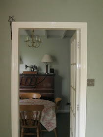
| Farrow and Ball Blue Gray and Earthborn Gregory's Den |
When picking my perfect paint, one of the things I like to do is look at pictures of other people's rooms who've already chosen plumped for that colour. If you're thinking about Farrow and Ball paint colours for your house then you've come to the right place because, let me tell you, Modern Country Style loves Farrow and Ball.
Choosing colours can be a tricky monkey, can't it? A very enjoyable monkey but certainly a potentially slippery one. The same paint colour can change almost beyond belief from one room to another. To refresh your memory, here is the grimness of what was here before in our kitchen and dining room:
 |
| Our Old Kitchen |
Uugh!
 |
| Our old dining room |
Our dining room and kitchen are separate but connected through a doorway. Because these two rooms are used in conjunction so often - when I'm cooking tea and the children are sitting round the table doing homework, or when we've got friends round for drinks of an evening - the colours needed to work well with one another.
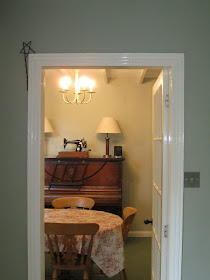 |
| Farrow and Ball Blue Gray and Earthborn Gregory's Den with the lights on! |
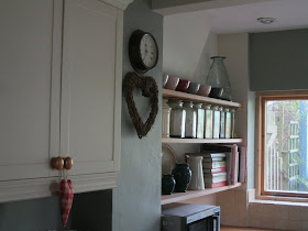 |
| Farrow and Ball Blue Gray and White Tie in the kitchen |
The dining room is painted with Earthborn Gregory's Den which is a palish glaucous creamy-grey. What I wanted for the kitchen was a darker version of Gregory's Den so that when you looked through from one room to another, there would be good chromatic flow.
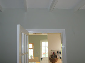 |
| Farrow and Ball Blue Gray and Earthborn Gregory's Den |
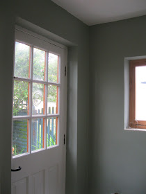 |
| Farrow and Ball Blue Gray with white gloss |
Howeer, Earthborn paints only comes in a set range of colours, which don't allow you to adjust to a lighter or darker shade. After a long but very pleasurable search (which you can
read about here), I decided on the combination of Farrow and Ball Blue Grey and Farrow and Ball White Tie for the kitchen.
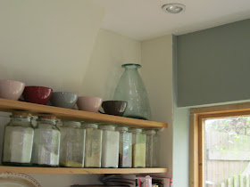 |
| Farrow and Ball Blue Gray and White Tie |
I'm pleased with the visual continuity that the two rooms now provide. When you look through from one room to the other, the rooms flow well. Not matchy-matchy, which can be the problem using a lighter version of a same-brand paint colour, but in harmony.
Tomorrow, on Modern Country Style, finally, I'll be revealing the whole kitchen. I'm very, verrrrrrrrry excited. I would have done it on day one of the kitchen series but I'm getting better at taking it slowly! Holding myself back isn't one of my better-known talents. ;-)
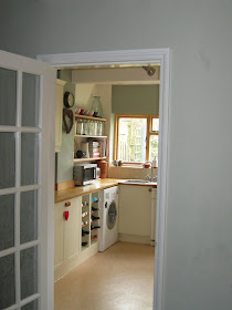 |
| Farrow and Ball Blue Gray and Earthborn Gregory's Den |


I love the flow you got goin' on between the two rooms. I am so bad at that, usually having to paint rooms several times to get them to flow.
ReplyDeleteCan't wait for the reveal!
Love the basket hanging on the kitchen wall.
ReplyDeleteHate the microwave - no place for one of them in a modern country (or any) kitchen!! Wink wink.
I love the colors that you picked, they are so earthy and clean. I can't wait to see your kitchen!!!
ReplyDeleteI'm very excited, too! I love the colours you choose, and yes, Farrow and Ball have the perfect colours for a modern country home! I wish I could use their paint, but here the nearest shop that sells them is about 50 km from where I live :(
ReplyDeleteHugs paola
I love that you have a nice flow going from room to room. I'm that way too...I think it gives things a nice, calm feeling :)
ReplyDeleteI saw Farrow & Ball on a ehxibition in Portugal- LXD -with a few brands! Amazing brands... such us "Boca do Lobo", that i fell in love... take a look at www.bocadolobo.com
ReplyDeleteThanks :)
ReplyDelete--
http://www.miriadafilms.ru/ приобрести кино
для сайта moderncountrystyle.blogspot.com
Your kitchen makeover is beautiful. Well done.
ReplyDelete