
 |
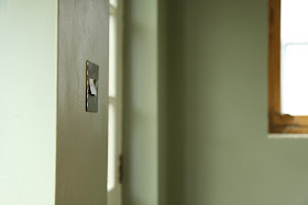
| Farrow and Ball Blue Gray and White Tie in our kitchen with the light on... |
Hello cutie pips,
There's so much loveliness I want to show you at the moment. So, so much. I feel rather excited by it all.
But first things first.
I'm thinking it's time for another Paint Colour Case Study.
 |
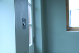
| Farrow and Ball Blue Gray and White Tie with the lights off |
So far, I've written features on Farrow and Ball Light Blue and Farrow and Ball Pigeon. Today, it's the turn of Farrow and Ball Blue Gray, which is the main colour that we chose for our kitchen makeover (yup, that's how they spell it: English company, American spelling? Not sure what's going on with that...).
 |
| Farrow and Ball Blue Gray in gentle daylight |
When I put together a case study for you, I source as many pictures as I can of the paint colour, from our house, here in the Cotswolds, and from the internet, in lots of different situations and lots of different lights so that you don't just have to rely on a teensy little square of colour on the tester card before you splash out on yet another sample pot.
 |
| Farrow and Ball's image of Blue Gray |
Basically, I hope these Farrow and Ball Case Study posts can do all the legwork for you so you can see at a glance whether the colour is going to work for you in *your* house with *your* lighting conditions. Here's a list of other Colour Case Studies for you to peruse...
 |
| Farrow and Ball Blue Gray outside in sunlight |
I've only selected pictures that I think are accurate reflections of what the colour really looks like, discarding those where the image has been tweaked beyond recognition or the flash has distorted the appearance of the colours.
The first thing that I need to tell you about Blue Grey is its intensity accumulates more than any other colour I've worked with. Particularly around internal corners and with a lack of natural light.Look at the shadowy internal corner of the picture below. See how much darker and more intense the colour is than on the chimney breast?
Really surprisingly green.
The more natural light you have in your room, the more of this gorgeous colour you can use.

The first thing that I need to tell you about Blue Grey is its intensity accumulates more than any other colour I've worked with. Particularly around internal corners and with a lack of natural light.Look at the shadowy internal corner of the picture below. See how much darker and more intense the colour is than on the chimney breast?
 |
| Farrow and Ball Blue Gray in warm daylight |
And the second thing is that it's surprisingly green for a colour called Blue Gray.
 |
| Farrow and Ball Blue Gray on Woodwork |
Really surprisingly green.
 |
| Farrow and Ball Blue Gray in the sunshine....aah. |
 |
| ...and Farrow and Ball Blue Gray in the rain. |
It's the strongest, warmest colour we've chosen for our house so far and that's because it's in the room that gets least natural light. Anything cooler would have made the room look washed out and cold.
 |
| Farrow and Ball Blue Gray with light streaming in through the large windows |
The more natural light you have in your room, the more of this gorgeous colour you can use.
 |
| Farrow and Ball Blue Gray in filtered daylight |
It's such a lovely colour. Warm and welcoming.
Here's a reminder of our 'before'.....
Here's a reminder of our 'before'.....
 |
| Our Old Kitchen |
And here's the after.....
What's that you say?
What's that you say?
You've spotted that we've used another colour alongside the Farrow and Ball Blue Gray? You're so very right, you Eagle Eyes, you.
There's a story behind it, wouldn't you know.....but more on that another time.
Now, anyone for another cuppa?
![]()
![]()
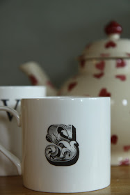 |
| Farrow and Ball Blue Gray and Emma Bridgewater! |


Images: Our kitchen, Our kitchen, unknown, Farrow and Ball, Gumtree, Cheverellwood, unknown, Our kitchen, Our kitchen, Country Living, Homes & Gardens, Country Homes and Interiors, Our kitchen, Our kitchen, Our kitchen.
Love this color. Thanks for the color study...I think I'll be using it in our master bath. It's beautiful!
ReplyDeleteyou are so right. colors look SO different in a change of lighting. great assessment and I love that color!
ReplyDeletedonna
Very beautiful.:-) Stina
ReplyDeleteLove blue gray!
ReplyDeleteI was thinking to use a color like this in one part of the walls of the stairs
Hugs
Mari
Thank you for the info! Although sadly I am coming to the end of my painting - it dies not take long in a 320 square foot home :)
ReplyDeleteYours is beautiful, can't wait to see more!
Debra
Hello my sweet Sarah! :-)
ReplyDeleteOh, colors! Walls! Yes! You can spend a day talking about one single color. It will change with light or the lack of it. I think you always should test it first. I told you before how much I love your kitchen. This color is a winner for me.
Great post, Sarah! And you always make me smile, little pip! ;-)
Have a Blessed week!
xo
Luciane at HomeBunch.com
Post of the Day: A Retreat in Brazil/ Britney Spears' New House.
Awesome post. I love the colour... Flicking through Uk magazines and listening to friends back home it appears that Farrow and Ball is 'the 'paint to have at the mo and anything else on your walls is a kin to painting them in Crayola (which my kids do)... I can see what all the fuss is about now! Lx
ReplyDeleteOohh forgot to ask... Does your kitchen look that organised all the time?? Swoon, Swoon. Lx
ReplyDeleteOk...so it is dangerous to come over here! Now I want to totally change my color scheme in my house after seeing all of those gorgeous photos! How are you friend? I've been out of town for a few days so I'm catching up with all of the lovely ladies in my life! :-)
ReplyDeleteVanessa
A lovely, restful colour. Farrow & Ball are my favourite paints by far,
ReplyDeleteSusan x
I love popping by your blog because I feel so young...lil pip :)
ReplyDeleteThe blue gray is a beautiful color next to white and I like the way the color changes at different times of the day. This was the color I was trying to achieve in the living room. I think it's pretty close.
You know I adore your kitchen! It's just right! Gorgeous kitchen in the photo you shared. I could spend the entire day in there. Yum!
Have a good day, Sarah Sarah!
xo
Dear Sarah, As you make the point so clearly here, Farrow and Ball paints contain a high percentage of colour pigment and therefore give an intensity of colour which makes them so very special. Usually I use no other paint than Farrow and Ball [even importing it for use in my Budapest apartment] but when looking for a good stone grey to use in a bathroom I was seduced by Zoffany's Fench Grey.
ReplyDeleteSarah, I'm loving this color and most all grays at the moment. Those images are all gorgeous! Choosing one however is proving to be difficult. Our room is sun drenched and has oak floors that lean toward yellow so I'm thinking gray would help tone it all down.
ReplyDelete-Rene
finding the perfect blue-gray...i find i have to look at the grey swatches not the blues. only have a bit of blue grey left in my house: powder room. dining room used to be blue-grey but it gets so much natural light that the color was too nursery-like and cool.
ReplyDeletewonderful photos and ideas, Sarah!
michele
Love this color Sarah! We recently painted our bedroom a color called Celtic Gray, but it has a lot of green in it as well.
ReplyDeleteAnother cuppa please! Hi sweet Sarah, that is a most interesting color! I am loving it! I have never seen a color that changed so much with the sun and shadow, though. It might be difficult to decorate around it. Would you use just grey accessories to be sure that it didn't clash or use green and blue, both?
ReplyDeleteHave a lovely day.
Hugs, Cindy
I am feeling the Farrow & Ball Blue Gray love, Sarah! And wow, doesn't it ever look so different in the changing light - I'd never get sick of that! It would be like a different room/different wall depending on the weather/light source. Thanks so much for sharing the love in such detail. Lovely! Looking forward to another cuppa with your next post. ; )
ReplyDeletexx
This color looks so pretty in your kitchen. It's amazing how different it looks in different lights.
ReplyDeleteHave a wonderful week!
Blessings,
Marcia
What a pretty colour and such an interesting contrast between the rain and sun shots!
ReplyDeleteI love that color, have always been attracted to it.
ReplyDeleteA most interesting post, Sarah. I like it that it's blue grey but with a hint of green.
ReplyDeleteLove the color! Crazy it can be such a chameleon in different light and material!
ReplyDeleteVery helpful information, Mrs. And I love your kitchen, lights on or off! xoxo tami
ReplyDeleteSarah,
ReplyDeleteI adore paint colors that change their hue with the lighting of the time of day! Our living room paint is like that . .. different from morning~ to~ evening.Thank you for this inspiring post!
Fondly,
Pat
just love and adore it with the white tiles - in that first kitchen shot - a refreshingly beautiful combo :) best le xox
ReplyDeleteA fantastic illustration of how different a singular colour can look depending upon the light. And here in our lovely UK, we get a lot of that cool blue light from overcast skies so it can change the colours even more than somewhere that is lucky enough to get lots more natural sunlight.
ReplyDeleteIt's a good thing to remember when choosing greys (and I'm a massive fan of the colour as you know!) - there are just so many variations, it's really best to paint swatches and see how it looks in changing light! x
Amazing! As if it weren't hard enough to choose a color!! I do like it though and would happily use it in any room.
ReplyDeleteXO,
Jane
Love that color! Do you know, I grew up in Canada, and therefore grew up spelling words such as "colour", "behaviour", "flavour" so I feel right at home here. Although the spell check is having a heart attack as I type this!
ReplyDeleteAh finally done for the day and get to put my feet up and drink in your gorgeous post!
ReplyDeleteThat is SUCH an interesting colour. You've done a stellar job on showing the colour in different light, so important! I love all the photos here... especially your kitchen, it is DARLING! Absolutely the perfect colour choice!!
Looking forward to the story behind the OTHER colour too :-D
Meera xx
Well I love this colour, its on all the outside doors and gates at our house, but in each situation it looks different. when you use a good paint they have more pigments and therefore pick up on different areas of light so sometimes it can look quite grey other times green. Your kitchen looks lovely painted in it, one of my all time favourites.
ReplyDeleteHope you have a lovely week.
Jillxx
I love this color. The last time I went for blue, there was too much green in it, and it reminded me of toothpaste. I will remember this color.
ReplyDeleteFondly,
Glenda
Simply gorgeous. It looks lovely in your new kitchen!
ReplyDeleteSarah you must have spent hours and hours finding all those different shots..and it really show us all how light changes a colour. Alot of people buy paint at our store and come back disapointed because it isn't the colour they wanted or thought it was. I have sent customers outside to the daylight with the sample to see what it looks like and sometimes it is not anything close to what it looks like inside.
ReplyDeleteA well done post my friend!
Melissa
Such a beautiful color and I love how it transforms a room in different lights! I just love how it looks in your kitchen! Thank you for sharing all these beautiful pictures too, I am loving that bathtub!!!
ReplyDeleteI love the color in your kitchen. Where in the states does one find F&B paint? I have never seen it before. I have used most paints availabe here at one time or another. Thanks Sarah for checking on me and for your sweet comments. hugs♥O
ReplyDeleteSarah you've done a wonderful job of presenting this. That is a lovely soft grey - sorry can't bring myself to spell it any other way :-) Yes, the undertones of blues and green are definitely there. I really appreciate this post, since greys have caught my attention lately.
ReplyDeleteYour room looks fantastic,
Cheers,
Lisa x
Wow it is amazing how light changes colors! Really enjoyed this post!!
ReplyDeleteHi Sarah, thank you so much for stopping by my blog and for the lovely, lovely comment...you're so kind:))
ReplyDeleteI'm really enjoying your blog!
Have a wonderful day
xo
It's me again Sarah. I wanted to let you know that I awarded you a stylish blogger award. If you have the time to accept it the details are over at my blog. I think your blog is beautiful and it truly inspires me!
ReplyDeleteTake care,
Rachel
Hi Sarah,
ReplyDeleteI love the Farrow and Ball Blue Gray colors! Wow! They are just fantastic together! I want those colors in my house now! Thank you for sharing your study with us! I spell gray (grey) both ways for some reason. I have always admired the English. Could be because that's where my ancestors originated from? I think I'll go have me a spot of tea and crumpets! :)
Blessings,
Sonya
So pretty, no matter the color or the lighting.
ReplyDeleteYou just never know what color you'll be coming upon when you enter a room.
Makes for a nice surprise, I'll bet.
I truly love that floor in the first picture.
Looks hand scraped.
beautiful.
i love farrow and ball colours.. they do have more of an intensity than other colours dont they..
ReplyDeletei love the colour you've shown. its good to see it in different lights also..ived used a really pale grey in my hallway but i think i could be a bit braver next time and go darker wil have to get you on the case for me!!!
charl
x
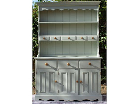
I'm seriously in love with that gorgeous dresser. I've been umming and ahhing for the past 6 weeks deciding what colour to paint the old rocking chair I found in my shed. The problem is now solved! Thank you Sarah. ;)Sharyne
ReplyDeleteYou are absolutely speaking my language here, Sarah dear. I have been dying to see and try Farrow and Ball paint for a long time, after hearing folks like you rave about them. I just did a bit of googling, and I found that there's a specialty paint store that carries F&B a mere half hour's drive from here. I see a road trip in my future!
ReplyDeleteLove how you've shown this color in so many different situations. People forget to try out the color in all parts of the room and wait a couple of days for it it really gel.. Your kitchen looks totally charming.
ReplyDeleteOh wow! I think I am in love with that color! It is gorgeous and I love that hutch by the way :)
ReplyDeleteI loved learning something new!I knew lighting played a roll in colors yet it was nice to really see the difference with each scroll.....
ReplyDeleteI have never thought of looking at samples on the computer before. Your walls are gorgeous! XOL
ReplyDeleteColor envy! The bathroom looks amazing and oh so relaxing. I love the change to the kitchen too.
ReplyDeleteHey girlie!
ReplyDeleteFor some reason,
your posts stopped
coming to my e-mail : (
Will re-sign up, as
I hate to miss them!
I'm in the middle of
a big paint project
at the moment and
definitely know what
you mean by the way
a color changes with
the daylight. Your
blue gray is gorgeous,
by the way!
xx Suzanne
ooh, thanks for posting this, I love this colour!
ReplyDeleteBlue grays are my new favorite color. It is funny they change color so much with the change of lighting. Once again I am inspired reading your posts! have a great day!
ReplyDeleteOkay, I don't think I know anyone that does a whole color study before painting. Maybe that's my problem. I'm the kind that shoots from the hip and just goes for it and then regrets. I absolutely love that color in your kitchen. I also love the picture you posted with that color on the cabiniets in the kitchen...gets me thinking...
ReplyDeleteLove this color! Actually, I love all three colors that you've shown. I didn't realize that you had given the name of the paint color of your bedroom. Now I might steal it:)
ReplyDeleteSarah, I love this blue gray. You are so right about how colors change with the light in a room. This looks like the perfect color. I'm going to try to find where I can get this paint in my area. Thank you for all your images they sure help to get a clear idea of a color.
ReplyDeleteOh my goodness! Your comment about the "Gray" American spelling & British company made me laugh! I love it!
ReplyDeleteWhat an amazing role light has on this color. It changes dramatically in every kind of light. I found that very interesting. Great post!!
Patricia :o)
I'm just dropping by to wish you a very happy day, Sarah!
ReplyDeletexo
Luciane at HomeBunch.com
Oh I do love your paint posts. I love gray but I am afraid it will look too drab and I will hate it! Yours looks fab by the way!
ReplyDeleteHoorah!! I have been ITCHING to know what the colour was that you used! Love it...now, where do I source Farrow and Ball in Aus...hmmmm....
ReplyDeleteBig hugs...been missing your blog of happiness...my fault, I know ;-)
Catch you soon chickie
Mwah
Cath
x
It's a stunning color and looks gorgeous in your kitchen :)
ReplyDeleteThanks for linking!
XO
Kristin
Lovely photos, as always! Out of curiosity, is that an Anthropologie mug I spy? :)
ReplyDeleteI've been looking for a color to paint my guest bath, and with your help I think I have found it! Thanks!
ReplyDeleteVery pretty color. Thanks for doing such a thorough study on it! Maybe I need to go with a similar shade in my living room. It is so bright in here that my well chosen light taupe color just looks white.
ReplyDeleteThat is such a beautiful color. I have been playing with the thought of painting one of our rooms gray, but I don't know if it will flow with the rest of the house that is painted in green, sage and beige.
ReplyDeleteI will just have to do what I always do, buy samples and paint all over the place to see.
Thank you for sharing.
The color I chose for my den is Ben Moore pale Smoke. I cut it by 1.2 with white because I was afraid of the "intensity" factor, reading somewhere (I think HB) that that is what one should do when all 4 walls are painted. I wish I hadn't cut it. The room doesn't get tons of light and would have done well full strength. That being said, I love the colors tone, it is definitely NOT green and that's what I wanted. Next up, finding a blue-gray for my LR and maybe a brownish-darker walls for the DR. Great post- love the color in your home.
ReplyDeleteWhat a useful info! Love the Blue gray color! your house looks so beautiful, the kitchen is such a cozy and warm place, and I do love all the photos that you posted there, so gorgeous! Happy Feathered Nest Friday!
ReplyDeleteI cannot speak any further. You got the sweet spot in choosing colors.
ReplyDeleteI must say that the chosen colors were all nice and they complement with each other. I also love the decoration.
ReplyDeleteYou've just won a forever subscriber!! Individual Color Studies?!?! Wow! Thank you, thank you, thank you!
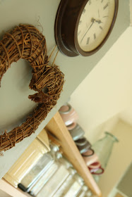
ReplyDeleteI love the colour! Just wondered where you got your wooden heart from because I love that too!
ReplyDeleteI got in from a seller on ebay. It's lovely, isn't it! It makes me smile whenever I look at it.
ReplyDeleteSarahx
ReplyDeleteHi. I just came across your blog and I love it! I'm doing a bit of a makeover of my kitchen and bathroom. My house is painted entirely in Farrow & Ball colours but I'm keen to try out some new colours and love blue/greens. We have a galley kitchen at the back of the house which faces north. I'm trying to decide whether to put in barely grey cabinets or blue gray ones as well as what colour to paint the walls. It is quite a dark room which overlooks our yard. Our living/dining room is open to the kitchen & is painted pale powder which I love but sometimes wonder if I should have gone a shade dark as it gets lots of natural light. I would love to hear your thoughts.
Juliet x
Our kitchen faces North-West and doesn't get a huge amount of natural light, [articularly in the winter.
ReplyDeleteFor North facing rooms, it's worth trying colours that seem much greener than you might otherwise choose as this counteracts the Northerly cold-bluish light.
Blue Gray on its own was definitely too dark - but, combined with White Tie, was perfect!
Sarahx
Thanks Sarah
ReplyDeleteAlthough I would love blue gray cabinets I'm thinking it would be too dark for my kitchen. Maybe I could save that idea for my dream home...I think French grey cabinets would work better with maybe a couple of walls painted blue gray or maybe light blue would work better? As I'm sure you can tell I'm pretty indecisive. I've been known to paint an entire room and then change my mind about the colour!
Thanks again for inspiring me.
Juliet xx
Such a useful blog! Wondering what your thoughts would be on using the blue tray/white tie combo for a hallway/corridor which has a south-west facing window? I love the elusive blue/green/grey quality of this paint, but wouldn't want to end up with simply green looking walls because of the quality of the light coming into the room... Thanks so much in advance for any advice - your expertise is appreciated!
ReplyDeleteHi Anna,
ReplyDeleteThank you for your lovely comment.
I think you might find that Blue Gray comes up as quite a strong colour under South/West conditions....definitely worth trying a sample in situ.
You might also also consider using Pigeon by Farrow and Ball, in place of Blue Gray.
Good luck!
Sarahx
Been researching Pigeon... Inspired! Do you have any recommendations for the woodwork alongside it to bring out the colour to its fullest? Thanks so much x
ReplyDeletethanks so much for this as it is a color that i am considering but having a hard time deciding due to the varied light in London!
ReplyDeleteThat sounds like a fantastic idea! Paint Colour Case Studies are always so inspiring and helpful for choosing the perfect shade. Can’t wait to see which colour you’ll feature this time and how it transforms a space!
ReplyDelete