
Welcome to the delicious world of
Farrow and Ball Down Pipe.
 |
| Farrow and Ball Down Pipe |
Before we get going, have you check out my other Farrow and Ball Case Studies?
Officially, this Down Pipe was designed to help 'imitate lead on exterior ironwork and to help 'lose' plumbing against brickwork.'
 |
| Farrow and Ball Down Pipe |
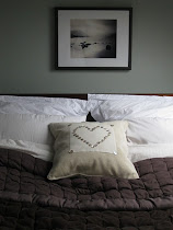
However, Farrow and Ball Down Pipe has become a rising star: morphing in recent years from being ultra functional to uber-hip. If you're looking for the perfect grey that's dark and sultry without sucking the life from a room then this is the one!!
 |
| Farrow and Ball Down Pipe |
There are just two tips I'd give if this colour is calling your name:
 |
| Farrow and Ball Down Pipe |
1) Farrow and Ball Down Pipe needs plenty of light to look its best;
if your intended room is not blessed with natural light then think carefully about how you'll provide this artificially.
 |
| Farrow and Ball Down Pipe |
2) Down Pipe could look sombre all on its own-some, make sure it's
surrounded by pale or bright colours. Abigail Ahern is an absolute genius at this.
 |
| Farrow and Ball Down Pipe |
In lots of the images sourced for this post, the colour looks identical - a sooty charcoal - but this is where I hope the fact that I've worked with all the colours I showcase on Modern Country Style really comes into its own.
 |
| Farrow and Ball Down Pipe |
{For more details, pop over to the gorgeous Relics blog, including great information about using Farrow and Ball primers - worth every penny.}
 |
| Farrow and Ball Down Pipe |
So while these super-styled images all appear the same, I happen to know that under fluorescent lights Farrow and Ball Down Pipe looks like this:
 |
| Farrow and Ball Down Pipe under flurescent lighting |
See how green it becomes? Magic!!
And under halogen lights, it takes on a bluey-green hue:
 |
| Farrow and Ball Down Pipe under halogen lights |
This is what I love about Farrow and Ball paints. To choose the right colour for the right room becomes a truly personal process. What looks perfect in one place will change beyond recognition in another.
 |
| Farrow and Ball Down Pipe |
I guess that's where the sample pot delicious agony comes in.....
 |
| Farrow and Ball Down Pipe exterior paint |
My favourite blog for fantastic paint tips and information is the Relics of Witney blog. Have you seen it yet?


Images via: Abigail Ahern, Angel and Blume, Baston and Lark, Farrow and Ball, Living etc, All The Best, mine, mine, mine, mine, Elle Decor, Snapdragon


24 comments :
that is a beautiful gray, I agree. donna
I don't think I have a room for this color, but I love the look it creates! I'm not sure I can get Farrow and Ball where I live. It's too bad, because I see so many of their colors in blogland and would love to try them. I'm with you on the giveaway!!
this color is amazing- moody and dark and beautiful!
I just adore gray and am quite smitten by the beautiful stairway. However, as we hurtle towards dull and dreary days I need walls that reflect the light and not absorb it. On the other hand, I might change my mind when spring comes.
Anna
This is a beautiful shade! I love seeing it in different light and with a nice selection of furniture.
XO,
Jane
what a lovely, lovely gray. Farrow and Ball colors really are amazing. Living in the Pacific NW means that we don't get much light in winter, either. I'm wondering if any of my rooms could handle this color, because I really do love it.
OOOhhh great review thanks :) it is a perfect shade of grey without brown hints that I normally find. Must show my brother this for his bedroom redo! Thanks!
Tina
Oooooh so pretty!
So different and yet so eye-catching sweet Sarah!
Deborah xoxo
Downpipe was the choice of paint for the outside of our house 7 years ago... front door, back door, windows etc..
We don't have it inside the house though...but looking at your lovely pictures I might just give it a go!
Julie x
A lovely shade. I have not tried Farrow and Ball paint before but I have heard good things about it.
That is a gorgeous grey!!! I love it. It even looked good with the black upholstery on the chairs.
Hugs, Cindy
What a rich and gorgeous color. A stunning shade of gray.
Sarah,
Adore how this paint changes hues with the lighting used!
Fondly,
Pat
Oh, how exciting! From these Farrow and Ball blogs I have really started getting excited about interior design. I think I need to start planning and budgeting for some painting and interior decoration!
Love this grey, but I agree, a lot of lighting is essential.
Lizzy x
Love this post. Love the gray. Love your blog. The color is fabulous. My mom once had me paint every room in her apartment the same color. I was amazed at how different the color looked in each room.
Ooooh I am loving this color!! Sadly I do not get a lot of natural light but on a piece of furniture would be wonderful!!
xoox
Sarah! Love this series. I have a serious heart for most F&B colours and it seems you are hitting all on my 'to use' list.
This is such a beautiful color but I can see where it could be a bit dark in the wrong room. What a great series showcasing these beautiful paints in so many beautiful rooms.
Cozy
cloudy
thunderclouds
fog
dusk......
All this in one
little can! Love
the pop against
the white trim, too...
xx Suzanne
Hey sweetpea!
This is an interesting case study. I spend a lot of my days painting furniture, so I'm enjoying how color can be viewed. This grey is so rich. Beautiful! I like how it pairs with white. Hmmmm... I'm thinking how great this would look as an accent wall with white framed photos. Love how it looks with the white dresser you have pictured.
Thanks for sharing your take. I need to check out the Relics blog.
Have a lovely almost weekend.
xxxxxx
Beautiful! I'm so happy we're starting to see more color. I wasn't able to get into how hospitals used to look trend. I'm pretty sure I wouldn't want a huge painting of a terrorist with a gun in my living room though.
kathy
Oh I love this colour! Reminds me a bit of the colour I used in my dining room - in dim light, it picks up a more browny-purple-y tone and looks more bluey-grey in natural light.
Stunning examples and Abigail Ahern is my hero lol xxx
One day when I have a grow up house, I want a snug or cloakroom that I can turn sexy with a dark colour like this. Love your paint case studies... seriously, you should be a colour consultant, you're such a smart cookie!
Meera xx
I found this blog really good better to keep on posting and hoping to see a post page of downpipe repair in Vaughan.
Post a Comment