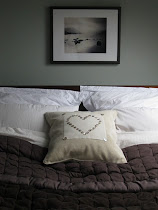
I'm very proud to present our Dining Room paint colour reveal! We used Gregory's Den by Earthborn. I struggled long and hard to find this perrrrrfect paint colour; I was a woman on a mission.

Here's a reminder of the Before state of our Dining Room. We took this photo as the previous owners were moving out. Dotty wallpaper plus border plus LOTS of varnished orange pine!
Here's another picture, facing the other way:
I wanted a lighter version of the paint I picked for the kitchen. F&B don't do lighter and darker versions of their colours generally so I had to ....shock, horror....go elsewhere!

Earthborn's Gregory's Den was a brilliant match for a lighter, less coloured version of Farrow and Ball's Blue Gray. I am quite extraordinarily pleased with the flow-through effect between the kitchen and dining room.
Earthborn's Gregory's Den is my favourite kind of colour: is it grey? Is it green? Is it blue? Yummy!

Gregory's Den used to be called Treehouse, which caused a great big muddle with getting hold of the paint, let me tell you. The only place I've found to order it online is here.
Earthborn paints have an incredibly chalky, matte finish, which looks utterly beautiful but, I have to say, isn't the most practical for sticky little hands so I am expecting to have to touch this up a fair bit.
Remember that this was a quickie makeover, rather than a rip-out-and-start-again. However, there was so much room for improvement that we decided to work with what we had and invest elsewhere.... but that that hardly seem to matter. The power of paint is incredible. Isn't it amazing what £50 can achieve!?
We're SO thrilled with this room. Strangely, for a room that wasn't completely over-hauled, this is one of my absolute favourite places in the house! The creamy grey of Earthborn's Gregory's Den is a fantastic start to one of my favourite makeovers ever...
For other paint studies, click away...
More details coming soon!
Love
Sarahx


 01
09
10
18 comments :
Sarah, this is stunning.Strong work.
I liked your descriptions ... is it grey? blue? green? I like paint that has different moods, too.
Many happy meals and memories in your beautiful dining room.
Fondly,
Glenda
Looks a great room to be in. A lovely to room to share happy mealtimes together.
love it, sarah. i know how tough it is to find that perfect blue-grey, and you've found a winner!
smiles to you.
michele
Isn't it amazing what the perfect paint colour can do. Your dining room is beautiful!
Wonderful colour and a lovley room Sarah. I love a paint that changes shade according to the time of day.
Beautiful as ever ~ xx
What a transformation!
I love the color. You are right when you said depending on how you looked at the wall it could be green then it could be grey. It is a much needed improvement from what it was before. If only it were more practical for little hands.
Please visit My Webblog: PhD by Publication
Thank you very much for your attention. You know what is a persuasive essay ?
Neutral colors have the power to transform your home. I don't understand why people use dark colors in their homes. I always prefer neutral colors especially blue one. Do My Dissertation
What is a motivation letter? This is the first question you must answer if you want to become successful in this activity. You may think that getting a good motivation letter example is an idea worth considering https://bestcustompapers.com/motivation-letter-writing-service.html
I am agree with you, that the creamy gray of Gregory Earthlings' Lair it is a fantastic. It is like style which description in english literature. I write english literature essay topicsnow, so I know it
I received a very well-written paper with obvious research done by the writer. I can only say that I am so happy and highly recommend Dissertation Service UK
They look Extraordiary.
Dissertation Writing Services
This was the best post. Online assignment help.
Thanks
The colour of the dining room's paint turns into an inspiration in this charming makeover story. The fascinating combination of grey, green, and blue found in Earthborn's Gregory's Den is the result of a quest for the ideal colour. The kitchen is fluidly connected, demonstrating the power of choice through the flow-through effect. However, there's a hint of professionalism here as well, similar to an action writing company refining the script. The progression of the the environment, completed on a small budget, demonstrates the amazing power a well-selected colour scheme can have.
Male erectile dysfunction treatment affects most men and at some point in their lives they will experience erectile dysfunction problems, however for some the problem may be chronic and long term. Indeed, various researches have estimated that close to a half of male population above 50 years in the United States has experienced the condition in some form.
Stem cells for ED
Post a Comment