Monday, 28 February 2011

How to add Soft Industrial elements to your home: An Antique School Clock


Hello, you. Come on in out of the cold.

Well, I say out of the cold, but I do believe it's the feeling rather mild, in my little spot in the Cotswolds. Indeed, I would go so far as to say that I felt sunshine this week.


Real warmth on my back.

Although Mr Modern Country insists otherwise, I say that the 1st of March is the beginning of Spring. Which means that today is the last day of winter.


And look, here are some photos of one of my very favourite things. Ever.

Ever, ever, ever.

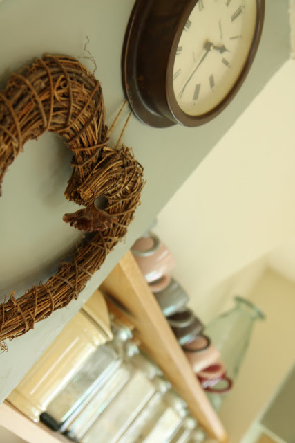
It's an antique school clock. A definite note of Soft Industrial.

 I love thinking of its previous life. I wonder how many children have looked at it longingly, waiting for hometime, willing those hands to move faster.


It's not a gigantic one like the pretties in my last post but it's certainly large by most clock standards.

Large enough to be a real statement, which is what I'd hoped for. Not a clock with a photo of rust stuck on it like my first attempt.


It's been lovingly restored by a specialist, and given snazzy new modern workings, while maintaining its outside wondrousness.

Yup, this baby has had its innards removed purposefully. All the cogs and whirrables are gone and have been replaced with a simple Quartz mechanism, accessed through the original hatch at the bottom. Which means there is much, much less to go wrong.


It has a mahogany outer casing with gorgeous brass detailing.

And I love the shape of the clock hands.


And, of course, I love the way the clock proudly declares that it was Made In London, England


I've had such a lovely morning today. All. On. My. Own.

Yes, the children are back to school. No one has chicken pox any longer.


I've had a good tidy up. A good read. A good bit of oboe practice. A potter in the garden. And now a lovely chat with you.

And all before lunch.


Busy. But in a languorously relaxing way. Just a bit of this and a bit of that. Whatever takes my fancy today.


I thought I needed a day or so to rest after quite a hectic few weeks, what with the holidays finished and spotty, ill little ones back to school.

So I plan on taking it easy all day.

Aaahhhhh.....

Well, at least until the hoardes come home.


Enter your email address:

to subscribe to Modern Country Style


Saturday, 26 February 2011

Modern Country Loves: Big Wall Clocks


Welcome back to Modern Country Style Loves. I haven't done one of these posts for a while but felt it was time to resurrect the series in honour of big wall clocks.

I've been away by the seaside for a few days at my parents' house as part of the children's half-term holiday. It was a lovely ending to what I shall remember as our chicken pox season.....which is now over. Huzzah!!


Yes, one twin got it and then, as he was recovering, the other got it too. Poor little mites. They were so sad and serious and sore and sensitive and (yup, on a roll with this s thang) soporific and spotty.


So I've been housebound for quite some time (hence resorting to bizarre word games to pass the time).....and, after the initial happy-time-baking-and-reading-and-cuddling wore off, was definitely starting to flag.


Going away was just what I needed to give me a bit of a kick start back into the life of a normal person again.

Oh, so *that's* what the outside feels like.


There's nothing in the world quite like a hug from my mummy. ;-)


I'm back again with a bounce in my step.

Do you remember me saying that I was obsessed with huge clocks? And that I love a bit of soft industrial?


I realised that I'm not the only one with a clock-related frenzy so this a blog post dedicated to these beauties. Eye-catching, jaw-dropping, knee-knocking, spine-tingling vintage wall clocks.


Here is my top tip for buying one. It comes from experience. Don't buy one that you haven't seen in the flesh that seems remarkably cheap. Yup, that was me. 
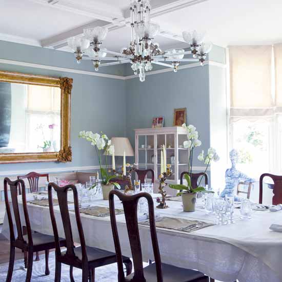
The photo looked just what I wanted so I clicked the Buy button and when it arrived.....

I thought those table and chairs were miniature for a moment....until I realised that it's the fireplace and clock that are giant-sized.

.......it turned out to be a photo, yes, a photo, of a rusty vintage clock stuck atop a new hideous plastic one. Bleeeuurgh.

I returned it after looking at it for less than a second. Soooooooo not the look I want.

It was very cleverly done but seemed to sum up all that I hate about the current craze for faux-vintage. The point of vintage is that it *is* vintage. The dents are because it's been loved and used and has served its time. 

Not that it's a cheap mass-produced knock-off.

It was sent back the same day.


I've put together this collection of the very best images of huge wall clocks that I could find.

A vintage clock is a fantastic way to introduce a bit of soft industrial to your home, without going down the hardcore factory look.

I can't wait to show you mine.


It's so good to be back.


Images via Living etc, Apartment Therapy, Things That Inspire, Houzz, Farmhouse, Kathleen Hay, River Oaks, Tiny Boxwoods

Enter your email address:

to subscribe to Modern Country Style


Wednesday, 23 February 2011

Gwyneth Paltrow's Kitchen


This is Gwyneth Paltrow's kitchen in the Hamptons.

Yup, a bit of celeb snooping today.

Black. Gwyneth.

Who'd have thought?

So it *is* possible to do dark in the kitchen, as long as there's lots of natural light that comes flooding in.

Which there is here.

Which there's not in our kitchen.

No, siree....but more on that next time.

In the meantime, how can I possibly mention Gwyneth without reshowing Gwyneth Paltrow on Glee.

Let me hear you say 'Brella, Brella, Brella...'


It's half term this week so if I'm being super-duper quiet, which I have been, then think of me neck-deep in Lego and Barbie.

I'll be back before you can say 'If I've picked that up once, I've picked it up a thousand times'....

Enter your email address:

to subscribe to Modern Country Style


Monday, 21 February 2011

Case Study: Farrow and Ball Blue Gray


farrow and ball blue gray
Farrow and Ball Blue Gray and White Tie in our kitchen with the light on...

Hello cutie pips,

There's so much loveliness I want to show you at the moment. So, so much. I feel rather excited by it all. 

But first things first.

I'm thinking it's time for another Paint Colour Case Study.

farrow and ball blue gray
Farrow and Ball Blue Gray and White Tie with the lights off

So far, I've written features on Farrow and Ball Light Blue and Farrow and Ball Pigeon. Today, it's the turn of Farrow and Ball Blue Gray, which is the main colour that we chose for our kitchen makeover (yup, that's how they spell it: English company, American spelling? Not sure what's going on with that...).

farrow and ball blue gray
Farrow and Ball Blue Gray in gentle daylight

When I put together a case study for you, I source as many pictures as I can of the paint colour, from our house, here in the Cotswolds, and from the internet, in lots of different situations and lots of different lights so that you don't just have to rely on a teensy little square of colour on the tester card before you splash out on yet another sample pot.

farrow and ball blue gray
Farrow and Ball's image of Blue Gray

Basically, I hope these Farrow and Ball Case Study posts can do all the legwork for you so you can see at a glance whether the colour is going to work for you in *your* house with *your* lighting conditions. Here's a list of other Colour Case Studies for you to peruse...


Farrow and Ball Blue Gray
Farrow and Ball Blue Gray outside in sunlight

I've only selected pictures that I think are accurate reflections of what the colour really looks like, discarding those where the image has been tweaked beyond recognition or the flash has distorted the appearance of the colours.
 

The first thing that I need to tell you about Blue Grey is its intensity accumulates more than any other colour I've worked with. Particularly around internal corners and with a lack of natural light.Look at the shadowy internal corner of the picture below. See how much darker and more intense the colour is than on the chimney breast?

farrow and ball blue gray
Farrow and Ball Blue Gray in warm daylight

 And the second thing is that it's surprisingly green for a colour called Blue Gray. 

farrow and ball blue gray
Farrow and Ball Blue Gray on Woodwork

Really surprisingly green. 

farrow and ball blue gray
Farrow and Ball Blue Gray in the sunshine....aah.

farrow and ball blue gray
...and Farrow and Ball Blue Gray in the rain.

It's the strongest, warmest colour we've chosen for our house so far and that's because it's in the room that gets least natural light. Anything cooler would have made the room look washed out and cold.

farrow and ball blue gray
Farrow and Ball Blue Gray with light streaming in through the large windows

The more natural light you have in your room, the more of this gorgeous colour you can use.

farrow and ball blue gray
Farrow and Ball Blue Gray in filtered daylight

 It's such a lovely colour. Warm and welcoming.

Here's a reminder of our 'before'.....

Our Old Kitchen

And here's the after.....


What's that you say?
You've spotted that we've used another colour alongside the Farrow and Ball Blue Gray? You're so very right, you Eagle Eyes, you.
There's a story behind it, wouldn't you know.....but more on that another time.
Now, anyone for another cuppa?

Farrow and Ball Blue Gray
Farrow and Ball Blue Gray and Emma Bridgewater!


Images: Our kitchen, Our kitchen, unknown, Farrow and Ball, Gumtree, Cheverellwood, unknown, Our kitchen, Our kitchen, Country Living, Homes & Gardens, Country Homes and Interiors, Our kitchen, Our kitchen, Our kitchen.

Enter your email address:

to subscribe to Modern Country Style


Friday, 18 February 2011

Soft Industrial House Of Yum


 I think we alI pretty much agree with you that the Kitchen of Serenity was utterly gorgeous but completely devoid of character. Like a very beautiful but lifeless mannequin.

I loved the feeling of calm though. I want some of that in my kitchen. If the space was mine, I'd just float around in a haze of tranquility.

{Plus, let's be frank, the floating-business would stop any dirty footprints on that pristine floor.}


But, still.....I love spaces that reflect the people that live in them and that wasn't one of them. Who wants to live a showroom? Oh, no takers?


I think that's why I love touches of soft industrial so much. Pieces with a past add a whole heap of personality.

In the next couple of weeks, I'll be sharing some of the things that I've used to add a bit of pizazz to the space we have.


I love the kitchen here...but the rest of the scrumptious house caught my roving eye as well so I sneaked that in just for you.

Yes, YOU!

{Ooooh, the postman just knocked on my door with an Amazon delivery. I got a little bit sidetracked with looking at my jaw-droppingly-luscious new book - I DEFINITELY feel a book review coming on. It's been a while since the last one, hasn't it?}


I want a clock like that. And when I say 'I want', I mean obsessively searching. What are they even called? If you have any ideas for UK sources then please will you let me know?


After all my dillying and dallying about whether to have a Modern Country Style Facebook page, I'm loving it. Have you joined in our lovely chats over there yet?

I'd love you to click on 'Like' in the box below, if you're a Facebook member, and join in the happiness over there.


Can't wait to see you over there.

Have a fantabulous weekend, sugarbuns.

Mwah.x


House of Yum from Journal de Maison

Enter your email address:

to subscribe to Modern Country Style


Related Posts with Thumbnails
 
01 09 10