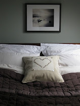
So then, we've had our tour of the
Something's Gotta Give house
...and now for the breakdown.
I mean breaking the decorative elements down.
Not an emotional kind.
Although I can quite see why that would happen upon leaving this beautiful film set. You wouldn't be the first and I'm sure you won't be the last.
{I shall be passing tissues around.}
Here are some of the elements that I feel hold this house together perfectly.
Yes, we're at that time when we talk about
HOW TO GET THE LOOK!
First, let's peruse at the BIG picture,
and then on Friday we can check out the little bitty details.
The first point HAS to be the harmonious colour scheme. Can you imagine stepping from one of these pale, softly-coloured rooms into a scarlet bedroom in this house? It just wouldn't happen.
Here, Nancy Meyer has gone with:
white,
cream,
blue,
and brown.
Each room has a slightly different reworking of this range but all the rooms pick up on the different colours.
Where's the blue in the dining room, I hear you cry?
Have you checked out the fabric on the chairs? See the little touches of blue?
Of course, within this tight palette, it's possible to include flashes of other colours...in the artwork, particularly.
The second BIG PICTURE point is consistency of style. Each room is decorated classically but with small nods to the beach location:
that stripy beach-towel rug,
the artwork on the walls,
the light and airy atmosphere.
Just perfect.
It doesn't matter what you're style is. But if you want to have a this feeling of gentle flow between rooms then try to stick to one style and one palette. Try it and see!
Thank you so much for reading.
Have a great day.


 01
09
10
25 comments :
I absolutely love pale and pastel colours in the home. Personally love beach cottage style, Scandinavian vintage style *sigh*. I wish I could re-do my whole house!
You are absolutely right about a cohesiveness to your decorating. Of course you can do whatever you like it is your house but to achieve a balance they say every room should flow into the next. These rooms are stunning. I love them all.
Hope you have a wonderful day!
I love this whole house/film set. You are so right about the colour palette needing consistency through out the house. Can you imagine a scarlet bedroom! ouch! :)
Pale palettes are my favorite and a gentle flow from room to room is something that I have always stuck with. A person can move furniture from one room to another and it always looks good. I love the classic style used in this movie set, love it!
Hugs, Cindy
I just love that movie, not least because of the gorgeous decorating style.
(by the way, i'll email you soon!)
Love that home -- great post on it!
I am so enjoying this series that you are doing on this gorgeous home. I HAVE to see the movie!!
XO,
Jane
Stunning house! When can I move in?
You so put your finger on it-consistency is so the key.
I'm so glad you brought "consistency of style" up... We have a decoration show here in France that have me screaming in front of my TV every Sunday evening because they decorate each room so differently it's a nightmare...
This "house" is so lovely, I do feel a breakdown coming on--good thing you thought of the tissues :). I do think consistency of style is important, and I am trying to make my home flow better in terms of palette. My trouble is that I have a bit of a split personality in terms of color, and love deep, bright colors like red, but also more soothing ones like in the SGTG set. I'm working on it...Thanks for this series, Sarah!
Gentle flow and consistency - good for many things! Love that kitchen!
xo Cathy
Love the beachy feel to the home. And I would totally love to replicate that dining room in my home. Well I have the mouldings anyway.
What a beautiful home!! I love the country/beachy/relaxed feeling to it all!
That's so true. I never really thought of it like that because I guess everyone looks at rooms individually to paint them but actually looking at them as a whole is what give it that flowing easy feel.
If I did paint a room scarlet then I think I would have to do the whole house in deep colours and that might be overwhelming!. I shall keep this in mind!
Lizzy x
p.s. Really enjoying this series!
Absolutely love the movie and the house. I remember rewinding just to check out the kitchen more. Beautiful...makes you want to cook! Oh, and redo your kitchen. ;)
That is such a gorgeous house house! I've always loved the kitchen and, of course, that nice calm color palette...that's perfect for me :)
The simplicity of the color scheme heightens the importance of the drops of color
The. Perfect. Home. :)
You're right! I do recall this house having a nice flow between rooms. There were definitely no jarring details. It was classic yet modern in some way. Perfect!
My all time favorite movie house!!!
The chairs would have looked much better without the fabric on.
What a great post, Sarah. I think this would have to be one of my all time favourite movie homes. Melissa xx
Does anyone have any idea of a similar paint color for the walls in the dining room in "Something's Gotta Give"? I was told it was mixed and it's all lighting, but there must be a color like it out there in the real world! I have tried more than a dozen and can't seem to figure it out!
If you are looking for the art from Somthing's Gotta Give visit CanvasReplicas.com. I had them do the Rockaway Beach above the fireplace. Love the look of the whole house.
Post a Comment