
Farrow and Ball's Pale Powder is the paint colour we chose for our boys bedroom. It's the softest robin's egg you can imagine. Time for a Colour Case Study? You betcha! Here's the first sneak peek..
 |
| Our Boys' Bedroom Painted In Farrow and Ball Pale Powder |
Farrow and Ball describe it as 'the most popular of our shades of aqua. It has an unparallelled softness (a description they also used for Pigeon - come on, F&B writers, up your game - and in north facing room can read almost as a delicate grey, but it is rarely cold due to the inclusion of green pigment.'
 |
| Farrow and Ball Pale Powder Bedroom |
I first saw Farrow and Ball's Pale Powder at a friend's house about ten years ago and have been looking for an excuse to use it in our own home. As always with Farrow and Ball, we were not disappointed by the colour. Yes, these paints are more expensive, and, at times, I do have quibbles about painting ease issues, but the colour quality is top notch.
children's  |
| Farrow and Ball Pale Powder Bedroom |
To give you a firm leading on how accurate the Pale part of the name is, I have heard this colour described as white {insert cries of despair from me ;-)}. White it's NOT but it is true that when surrounded by bright natural light, it takes on a washed-out coastal air.
 |
| Farrow and Ball Pale Powder Dining Room |
However, contrast it with pure white and you'll quickly see that Farrow and Ball's Pale Powder stands up well as a colour on its own two feet.
 |
| Farrow and Ball Pale Powder Bedroom |
This is even truer if the paint is applied in a small room...
 |
| Farrow and Ball Pale Powder Bathroom |
...or where there's plenty of room for the colour to build in a larger room, such as round the alcove below....
 |
| Farrow and Ball Pale Powder Bedroom |
Interior designer Katie Ridder says this of Farrow and Ball's Pale Powder: "If you want something clean and neutral but more interesting than white, try this whisper of a color that goes green or blue in different lights. It adds character and a bit of age, it's easy to live with, and it makes a smoother transition to the adjacent rooms, which are full of color."
 |
| Farrow and Ball Pale Powder Bedroom |
As a pale but interesting front door colour, it's just perfect! Be warned that it may well be a LOT paler than you expect if your front door is in a sun-exposed position. Take a look at these beauties...
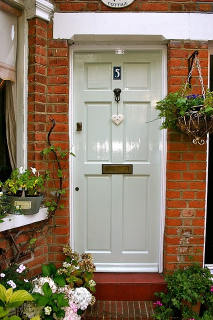 |
| Farrow and Ball Pale Powder Front Door In Full Sun |
 |
| Farrow and Ball Pale Powder Front Door In Shade |
Putting this post together involved sifting through a LOT of misleading images available online. DO not be fooled by some of the darker images floating around hyperspace. They must be photo-shopped, oddly lit or simply misnamed. I don't want you to be disappointed, my paint-loving friends.
 |
| Farrow and Ball Pale Powder Living Room |
Pale by name and pale by nature. This paint is a lighter version of Farrow and Ball's Powder Blue (still available as an archive colour), which we used for our front door six years ago.
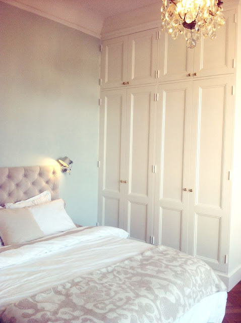 |
| Farrow and Ball Pale Powder Bedroom |
Pale Powder gave our boys bedroom such a calm, relaxing feel. It's not a big room and yet it felt instantly more spacious.
 |
| Farrow and Ball Pale Powder Bedroom |
Cathy Kincaid, an American decorator, says: "Everyone — men and women alike — loves this colour. It's a pale blue with a lot of green in it, and it's a little dirty, which makes it more complex than the typical pastel. I've used it everywhere, from kitchens to bedrooms. I even painted my office in it. People walk in and say, 'This is how I want my house to feel."
 |
| Farrow and Ball Pale Powder Painted Kitchen |
As always, for more colour casee studies, click on through...
Farrow and Ball New White
Farrow and Ball Old White
Farrow and Ball White Tie
Farrow and Ball Blue Gray
Farrow and Ball Middleton Pink
Farrow and Ball Old White
Farrow and Ball White Tie
Farrow and Ball Blue Gray
Farrow and Ball Middleton Pink

If you're looking for a warm, pale blue, with a hint of aqua, I think you've just found your Holy Grail!


Imags: Modern Country Style, unknown, Farrow and Ball, Remodelista, akadesign, Tokyoinja, High Class Decorators, unknown, Love and Lilac, Voysey and Jones, Turbulances, Sophie Bingham, Decorpad, House Beautiful, Houzz


6 comments :
This is such a gorgeous way to decorate an interior, and this colour is perfect for lighting up a space without being stark and cold. This is particularly ideal for older country homes where you need light but a worn and lived in feel. If you're thinking of moving to a new home visit http://www.autographestateagents.com/ for tips and advice
One of my favourite shade by F&B. I used the even paler version of it in my kitchen as it's facing north and it gave such a calm, descreetly coastal look to the kitchen!
It's just beautiful design..
Exclusive Furniture Cape Town
It looks very family-friendly! I also really liked this idea https://doors22.com/glass-room-dividers/. It used a glass divider, I think this is the best option when there is not much space in the house, but it is necessary to separate the rooms
Can you please suggest colours it will best combine with? My sea-facing build is almost complete and I love this colour but am at a loss how to create a scheme with it! Thank you!
[url=https://flic.kr/p/2kQCqVi][img]https://live.staticflickr.com/65535/51089770803_b77486365b_b.jpg[/img][/url][url=https://flic.kr/p/2kQCqVi]Room with a view[/url] by [url=https://www.flickr.com/photos/167214745@N07/]kirsty[/url], on Flickr
HI, can someone help, I am really stuck with the decoration of a porch entrance, short corridor leading to a livingrrom.
I like pale powder and pavilion blue, but I cannot decide what colours to combine them to. So far I thought of this:
PORCH:
WALL: Light blue for all the wall
WOOD: pale powder for wood (skirting boards, Windows and the doors)
CORRIDOR:
WALL: pale powder for all the wall
WOOD: Light blue or Teresa green on the wood (the skirting board, Window, and the door),
LIVING ROOM:
WALL: pavilion blue on the wall
WOOD: pale powder on the wood (skirting board, Windows, the paneling and the doors),
If pale powder is not contrasting enough perhaps sky light
Or light blue if sky light is still not contrasting enough
CEILINGS: all ceiling and the ceiling cornice in Wimborne White or Pointing or All white.
DOES PALE POWDER ON THE WOODWORK COMBINE WELL WITH:
LIGHT BLUE? (on the walls of a porch)
OR
WITH PAVILION BLUE? (on the walls of a large living room?)
If anyone can suggest any combination of colours that could work better?
Post a Comment