Hey there, sugarplum,
I hope you're feeling fine and dandy.
But if you're not, if the cold wintry greyness is getting you down, then I have something to bring a happy smile to your sad little face.
Just look at what I have for you today.....
 |
| Gorgeous After |
Only one of the most fantastic before-and-afters-on-the-cheap in the whole world ever.
 |
| Bleurgh Before |
Yes, siree.
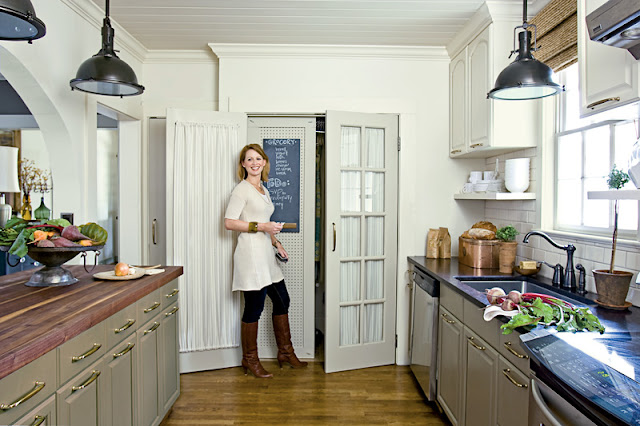
This is the kitchen of Anne Turner who was Assistant Decorating Editor for the magazine Cottage Living. It was featured in its last ever issue.
Anne has taken her kitchen that's best described as bleurgh......and made it scrumptious...but without a complete overhaul.
Her budget at the time was needed elsewhere.
{I don't mean to get off-track but was she wearing her slippers in that photo?}
{I don't mean to get off-track but was she wearing her slippers in that photo?}
{Aaahaaa, I see some of the budget went towards some new snazzy footwear....}
Let's look behind the scenes at this virtual decorating miracle. :-)
They've had the existing cupboards up towards the ceiling and added moulding around the top.
Then, with the extra space created, shelves have been fitted under the units. Aren't they darling?
They've changed the tiles, the worktop, appliances, sink, hardware, doors, taps, flooring and lights.
The result is like having a splediferous new kitchen without the huge cost of new units.
And don't you love the paint colours?
Pigeon on the dining room walls,
Lime White on the kitchen walls,
Stony Ground on the doors and windows,
Mouse's Back on the units.
All by Farrow And Yummy Ball.
{Which I do believe to be their official name.}
{Which I do believe to be their official name.}
Well, are you smiling yet?
No?
No?
This afternoon I will be having the pleasure of ironing my way through the laundry equivalent of Mount Everest.
Oh, the joy.
Bet you're smiling now....you ol' meanie.


 01
09
10
53 comments :
Wow, the kitchen is amazing! She looks pretty tall, but I can see why the ladder is in the last picture there! There is no way I would be able to reach the microwave on top of the fridge, not sure I would want to get on the ladder to get it either. But I'd definitely climb for the wine ;-)
Happy Wednesday!
Oh, what a great transformation!
But I agree with Samantha, the microwave is placed too high above the refrigerator
Hugs
Ooo... just the inspiration I was looking for. I love the stone grey lower cabinets with the white upper cabinets. The color difference between the cabinets is subtle but it makes a statement. I heart the French Doors hiding the laundry room!
Okay, where's my paintbrush. I'm not waiting until Spring to paint the kitchen, haha!
Hope you have a wonderful day, friend!
~Michelle
xo
You can call me Sugar Plum anytime. Flattery will get you everywhere :) XOL
What a gorgeous kitchen transformation!!! There is tons of yumminess there to be seen. I like what they have done by moving the cabinets higher and putting open shelves underneath, that would only work if the person who works in the kitchen is tall or if they don't really need the upper shelves in the units anyways, I'm thinking.
I love all of her copper pieces, even her KitchenAid, what a beautiful thing that is!
The light fixtures are very nice, as well as what they did with the kitchen pass through. I am loving it!
Thanks, Sarah, for a look at this very sweet remodel!
Hugs, Cindy
It's just gorgeous, my kind of kitchen, and the only thing left for me to do in mine is paint the tile, yep, paint it, still debating with hubby on it, and change out two light fixtures. I had never thought of bumping up the cabinets, that was brilliant. Sarah, such a wonderful post. I think this is one of my favorite kitchens, thus far! Thank you for the sweet words on my blog, you're too kind, and the feelings are mutual to say the least. I should have something for you in regards to your email soon, xoxo tami
I'm totally smiling now! That was such a beautiful transformation. I love the shelf running below the upper cabinets. Gorgeous!
Denise
This is GORGEOUS!!!! Absolutely breathtaking! I'm feeling so inspired after seeing a 'redo' even I could afford -- yay!! :)
Blessings!
Melanie
I'd still like to know what all that cost...with new countertops, new appliances, new backsplash, new paint...can't have been cheap. But it looks wonderful. And I would never have thought of move cabinets up for that custom look.
I loved Cottage Living magazine...I miss it so much it was my favorite. I remember this kitchen and thought it was so pretty, except for one detail that I thought was absolutely terrible...the placement of the microwave. What is up with that?
An excellent transformation! Good Luck with the ironing pile :)
You're right - pretty amazing. Just shows you what can be done !
Hi Sarah,
Such a charming kitchen! I noticed the hardware placement, I really like having the pulls more to the top of the cabinet door as shown on the bottom cabinets under the sink, then in the center of the door. I do not have knobs yet on my kitchen cabinet doors and like this placement so much I just might "borrow" this idea..
Also moving the top cabinets up was genius! I love the new look its just my style.
A really fun post, I enjoyed it very much.
Have a sweet day, Hugs~Elizabeth
whaaaaaaaaaaaaaaaaaaaaaaaaaa whhha whhhhaaaaaaaaa whaaaaaaaaa. THAT table wants to make me CRY!!!!!!! I had that exact table with 4 very very old pressed back chairs and in a moment of haste traded them for 2 iron beds....... I realized now I got the bum end of the stick...and got ripped off....whaaaaaaaaaaaaaaa and have been sorry ever since then....... I love the before and after shots but SARAH I just want to die!!!!
I would never smile at the thought of a mound of ironing, dear Sarah. I hate ironing with a passion and never do it if I can help it.
As for the kitchen, me like (apart from the location of the microwave - very silly).
Try to think of ironing as a zen like experience. A chance to do a simple task, taking care of your loved ones, and time to let your subconscious work out some issues while you check out for a bit. :)
The Befores and Afters in this kitchen are quite dramatic!! I see a few ideas here that I will be taking with me as I redesign a cottage kitchen for a friend's tiny rental house. Pushing the upper cabinets to the ceiling and adding the shelf below is GENIUS! Don't tell anyone I copied the idea from her, okay.
Ironing??? Boo, Hiss!!! Think Abercrombie and Fitch and just go wrinkled.
Wow! What an amazing transformation. I like this post very much and will share it with a friend who's currently renovating her kitchen. Thank you!
Laughed out loud at your final comment - I would never smile when ironing is in the sentence!! What a fabulous overhaul and just love the colors - but that's why their name includes yummy! Great post!!
Oh beautiful girl you do make me smile!! :) I love this kitchen, so open and airy. What a great ideas with the cupboards! The colors are wonderful and evening the dining area in the first picture is gorgeous!!!
Have fun climbing Mt. Neverest!! hee hee!!! :)
loved COTTAGE LIVING. love how she broke the rules with hanging the the upper cabinets higher for more vertical space--a renegade spirit after my own heart!
good stuff, mon petit chou.
michele
hellolovelyinc.blogspot.com
I cannot believe the transformation of this kitchen!!! To answer your question, I am alive, needing to get things done, but managing to waste 3 hours today, ugh. Here's to tomorrow!
Erinoooooo
What a great post!!
I can't believe they just moved those cabinets up and added moulding! That's pretty genious!
I want to add moulding to my cabinets REALLY bad...but I have NO idea how to cut moulding and it kind of scares me. Maybe someday I'll get up the nerve (and money).
hihi!!! good luck
Those boots, that amazing copper breadbox! I'll still be smiling as I reach for my own overstuffed bag of ironing, thanks sweetie!
Perfectly lovely! I'd never be able to reach those upper cabinets, though. She appears to be about a foot taller than me, so maybe it's not a problem for her.
I'm going to guess that those are ballet flats and not slippers!
Dear Sarah, As I am sure you can well imagine, I am NEVER smiling when in a kitchen...mine or anyone else's. I am always either trying to get out of the kitchen as quickly as possible or afraid whilst I am in there. Whatever, a kitchen experience is never good as far as I am concerned.
However, I do admire how the kitchen which you feature here has been transformed without resorting to an eye-watering budget. That I totally approve of since every penny spent on the kitchen is a waste as far as I am concerned.
Lime White.....perfect....my entire Budapest apartment is painted with this glorious F and B colour!!
Well, thanks to you and all your pictures lately I'm now obsessed with gray painted cabinets, I'll have you know. Too bad I just did mine white this summer. The agony! Oh well, there's always next house!
I nearly fell off my chair when I saw these pictures, Sarah. I had cut them out of the magazine years ago to plan my kitchen redo at the time. I came pretty close, too...the open shelves and subway tile and light fixtures. I really wanted the wood counter tops but they weren't very practical. It was a great article and as I said, the pictures were SO inspiring. Someday I will post pictures of my kitchen.
XO,
Jane
What a great kitchen! I love how they raised the cabinets and added crown molding above and shelves below!
hmm. Not my kinda kitchen but whatever floats your boat hunny....
Hi Sarah~ Gorgeous gorgeous kitchen. I love the french doors in there- fantastic- and I love cupboards that stretch to the ceiling- it all looks beautiful! Love the colors too!! Thanks for sharing! Hugs, Courtney
That arched opening is unbelievable! Love the added shelving, too. The colors are gorgeous.
Gorgeous! I do love my own kitchen makeover but I see transformations like this (and yours) and wish I had done a few things different (although there are reasons I did not). So very pretty!
Fabulous remodel on the kitchen. I love just about everything about it especially how they raised up the cabinets then put the shelving underneath. That is brilliant!
LOLOLOLO So we better climb the Mount Everest together! I have the same amount of laundry today! Oh, life!!! :-)
Love the transformation here! I love seeing pictures like these. They're so fun!
Great post, as always!
xo
Luciane at HomeBunch.com
Post of the day: Tracery Interiors
PS: thanks for your sweet comments, Sarah! You're the best!
I seriously love coming to visit your blog! Always smiling when I am here :)
Hey, by the way....you just got a well-deserved award my dear. Come stop by my blog and check it out!
Lovies!
XOX
ps - Oh Cottage Living how I miss you so :(
great transformation! How can you not smile looking at that? and it really did look like she was wearing her slippers!
I am a meanie because I'm smiling that my guy does his own ironing!! :)
What an amzing before-after. LOVE IT great job and so Inspiring
Karryann
Sarah,
Great transformation, love the arch and the cabinet colors! In a way, don't you find ironing a kind of zen like experiance, not when it's a mountain and not often, just once in a while?
Rebecca
Is this the same
Cottage Living as
we had in the States?
'Cause I think I'm
in love....YES, there
is a smile plastered
here, from ear to ear....
Thanks, Sarah!!
xx Suzanne
Hi Sarah- I have been remiss in hitting the blogging world! Love all your recent posts... when I grow up I wanna be Nigella! i painted my kitchen when we moved in a year ago, sort of grey-blue cabinets with light blue island. I'll have to post it for you. (Are you on Facebook?) The colors are great. I painted my laundry the most heavenly shade of lavender too!! I love paint. xo
I love gray I just painted my bathroom gray. Were they beets in the bowl? Eh, not a fan of beets, but her kitchen is gorgeous! and LOL at the comment about her boots!!
An entire semester of horticulture and coming up with names for flowers is proving to be difficult. Magnolia, Narcissus (sp?only "n" I could think of...aka Daffodil) and Orchid.
:D Michelle
xoxo
I do love the grey and I too wonder about the actual cost. You can iron for me...I seldom get around to it♥
All I can say is fabulous! What a transformation.
Smiling now : ) Thank you!
Alison
holy moley that is fabbo !!! le xox
OH! it was better!!!!!more clean, more light! kisses!
What a transformation!! Love it!! However, I wouldn't have been able to raise the cabinets; I'm too much of a shorty. darnitall.
Love your blog! thanks for checking out our blog. I'm off to look at more of your posts.
Yay! Found this through Pinterest & so happy I did. I remember this in Cottage Living, one of my favorite mags . I was so sorry to see it go. Thanks !
We're planning on doing something similar in our kitchen, and I'm wondering how they attached the shelves to the subway tile. Do you know of any sources/explanations for how this is done, on this or any similar project? Thanks so much!
Great article.
Post a Comment