
 |
| Farrow and Ball Blue Gray and White Tie with Emma Bridgewater teapot! |
Hey duckies,
Yup, it's Farrow and Ball Case Study time again...
{Can you hear their siren-like call?}
I LOVE Farrow and Ball paints.
Love 'em.
{Can you hear their siren-like call?}
I LOVE Farrow and Ball paints.
Love 'em.
Farrow and Ball's Blue Gray would have been too dark a colour for our kitchen. It has so many internal corners that the colour intensifies hugely. The Blue Gray needed toning right down in this room...and what better way to do that than to introduce a gorgeous creamy white?

But which one?
There are seriously a bajillion off-whites
to choose from out there.
to choose from out there.

We chose Farrow and Ball's White Tie.
It's been perfect. Just exactly the right amount of white to really knock back the Blue Gray but enough yellow to warm up the room.
It's been perfect. Just exactly the right amount of white to really knock back the Blue Gray but enough yellow to warm up the room.

And it goes superbly well with the cream Shaker cupboards.
That was a big concern.
I compared a lotta, lotta off-whites to get this right.
That was a big concern.
I compared a lotta, lotta off-whites to get this right.

Farrow and Ball paints are always my first port of call. Are they yours?
If so, you're at the right place. Have a look at my other case studies:
If so, you're at the right place. Have a look at my other case studies:

When I put together a case study, I source as many pictures as possible of the paint colour, from our house, here in the Cotswolds, and from the internet, in lots of different situations and lots of different lights so that you don't just have to rely on a teensy little square of colour on the tester card before you splash out on yet another sample pot.
 |
| Farrow and Ball White Tie and Blue Gray |
I hope these Farrow and Ball Case Study posts can do all the legwork for you so you can see at a glance whether the colour is going to work for you in *your* house with *your* lighting conditions.

I've only selected pictures that I think are accurate reflections of what the colour really looks like, discarding those where the image has been tweaked beyond recognition or the flash has distorted the appearance of the colours.
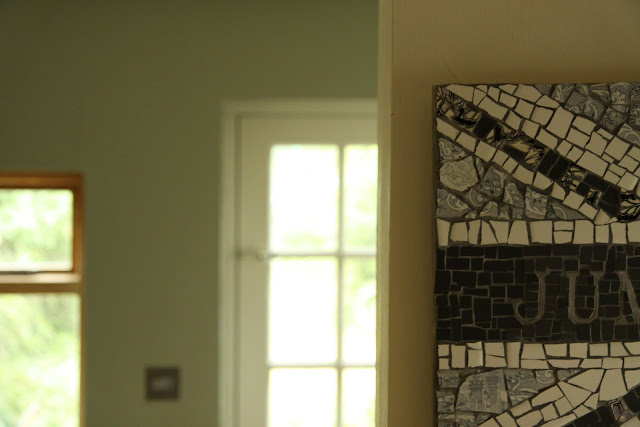
Here you can see the same part of our kitchen, with my lovely China Jack Mosaic, at three different times of day: morning, noon and evening, with the weather ranging from overcast to sunny.
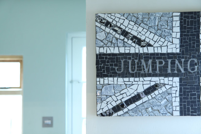 |
| Farrow and Ball White Tie in overcast skies |
 |
| Farrow and Ball White Tie In Sunshine |
 |
| Farrow and Ball White Tie and Blue Gray in the evening |
If you're going to use Farrow and Ball's Blue Gray,
then I'd truly recommend Farrow and Ball's White Tie
as its accompaniment.
They go together like bacon and eggs.
See my kitchen-appropriate analogy?
;-)
My favourite blog for fantastic paint tips and information is the Relics of Witney blog. Have you seen it yet?


Images: mine, Shirofugen, Veranda, mine, mine, Farrow and Ball,
mine, Farrow and Ball, Mine, mine, mine.


45 comments :
Great tips, Sarah. I am really not good at choosing paint. I seem to go for coverage, and color. I know I need to really take more time to enjoy and look for brands that are stand out. Love, the photos of your kitchen, everything is so organized, and with three little ones. Good job on that too. xxx
Is Farrow and Ball paying you? Because they really should be. Or at least giving you free paint. Seriously.
Gotta love that F+B. I just mentioned them today too! I love the blue gray!
Thank you! No, they're not paying me. This is just my own opinion.
Love your colors in your kitchen Sarah and the white you chose looks perfect! :)
I love your colors. Here in the states, our often go to paint is Benjamin Moore. And the white I used for trim in our MN home was called "vanilla ice cream." This is strange, but I have to like the name of the paint, too. White Tie - love it.
Your kitchen shelves are so inviting - adorable tea pot, cups, glass containers, cookbooks . . . all things I enjoy, too.
When is your home going to be featured in House Beautiful?
Fondly,
Glenda
I've never seen Farrow and Ball here in our paint stores. Your photos are beautiful though :-)
Blessings,
Marcia
I do love F&B paints, you're kitchen looks amazing, good choice of colours :)
Bee happy x
Have a delicious day!
Hi Sarah - perfect choice of colors. Have not tried the brand yet but heard all good things about it.
The best part about your post today, I learned a new word ;) - "bajillion"
Great day to you!
-Marie
Every picture put a smile on my face! Light, bright and yet soft at the same time. I'm thinking you should be their new spokesperson! :-)
Vanessa
P.S. Noticed you went over 1000 my friend!
The white looks so good with the rest of the subtle colors. Lovely photos.
- Jou
The gray and white will look absolutely fantastic! The inspiration photos are dreamy.
Love the colours you've chosen and it really is the perfect white :)
I love Farrow and Ball paints Sarah!...I am about to embark on decorating my kitchen using these colours...lovely images too...
Susan x
Have just painted our bedroom - tried 15 different slotches from matchpots on the wall. F&B WHITE TIE was not one of them!! I need to consult my colour card - in the end we used Wimborne White to go with an accent wall. WHITE TIE looks lovely - Oh dear Husband will shoot me if I change my mind!
Adore grey and white - home, garden and at least half my wardrobe!! X
Have I mentioned how glad I am that 'magnolia' isn't in your vocabulary. I think looking at this that I finally get why someone would differentiate between glossy and matte paint.
Wow, the difference of time of day and lighting is unbelievable. Blue? Tan? Green? All gorgeous though!
I really appreciate this post as I want to use Farrow and Ball paints for our new home. Thanks so much. I have admire the Blue Gray as I have seen it used in many issue of Country Homes & Interiors. You should be paid by F & B as a spokeswoman! Thanks so much, Ann ~ Australia.
Beautiful color choices...and beautiful inspiration photos. I'm familiar with that white -it is very rich and creamy, love it!
Paint colors look pretty. The foyer/staircase is by far my favorite.
Swee-eet! I am really loving these colours you have chosen. They just sing to me :-)
hugs
Cath
I love your kitchen colors Sarah. They go together perfectly :)
~tricia
Sarah,
First, love the name White Tie! White is a hard one to choose and get right but that looks lovely. I like a warm creamy white, not to yellow and definately not the cold gray ones. Your kitchen is so cute! Great job!
Rebecca
Hello sweet girl, I have not been around much lately, I am so sorry if I have missed some of your great posts. My life has suddenly turned very busy and could get worse. I'm hoping not!
I love the Farrow and Ball Paint, from what I have seen on your blog here. It looks so lovely in your home. I don't even know if it can be purchased here in Canada. I should check and see.
Interesting case study, thanks for the info!
Love and hugs, Cindy
I fuss for ages
before landing
on THE color : ) !!
Thankfully you can
now get small sample
pots of good paint
to try before taking
the plunge and doing
a whole room. Love
all of your case
studies, Sarah!
xx Suzanne
It will look awesome and thanks for the paint tips, it really can get confusing!
Lezlee
I love your house! So beautiful, Sarah.
We don't have F&B in the States. There is a high end paint, Benjamin Moore, but I don't think it has the same depth to it. The BM guy even told me they don't have the rich pigment F&B has.
I would LOVE to own a house here one day and play with the F&B paint. The morning, noon, & night study of your wall is fascinating! XOL
I had never heard of Farrow and Ball until I started reading your blog, but I love their colors. These are some of my favorite posts. I love that you showed the paint at different times of day, too.
Sarah, your kitchen looks great, but I do know what a nightmare it can be picking paint colours. As you've depicted, the variation in a room according to the time of day and light available, can be dramatic. I love Farrow and Ball colours, but in Australia they are very expensive, so we tend to colour match with Dulux, and with the Aussie light being that bit brighter it can be hard to achieve the same sort of depth. I agree with Happy Homemaker, it would be great to play around in a house of our own her in U.K., but at the moment making do with the ever popular magnolia emulsion in our rental!! Robx
Hi Sarah, back and catching up on all your recent posts. Guess what I always have a bag to take with me if I am off for a session of reading (sunbathing)in the garden. You have similar tastes to me although of course from a much younger point of view, Farrow and Ball paints, red Agas, and I covet that teapot. :) xx
Magnolia is a bad word in my house but this is a beautiful creamy white with not too much yellow (my biggest complaint about Magnolia is that it looks dirty to me) - the combo with the blue grey is stunning!
You are a genius, Sarah. I know, I'm always saying that, but you are!
What I like is that little collection of cups you've got on your kitchen shelves. Like them. A lot.
Have a lovely day. xx
Your home is so lovely my dear and I love the paint color you chose. I have yet to try these paints, they really have some wonderful colors.
Thank you sweets for the tips!
Hugs!
XO
I love your case study posts! I always need time to find the right colour or even material. I mean it looks so different under the neon lights of a shop and then in a small home. For the tiles, it took a lot of convincing (and what I hoped was my prettiest smile) to get a free tile to see what it would look like at home.
Have you tried to find picture on the Internet of the Farrow & Ball dead salmon? I tried, just because the name cracks me up and I wondered who wanted dead salmon in their kitchen, but couldn't find any!
Hey Sarah!
I actually chose our kitchen cabinet color from posts you'd done in the past. I never realized how many whites there were, either. It's overwhelming when you go to the paint store. They never look the same when you bring them home. I love the color of your cabinets and walls. They are gorgeous! And, how cute is that shelf with all your jars and mugs. Love :)
Hope you are doing well. We've had non-stop rain and I had a stomach bug, yesterday. On the tail end of it. Ugh!
Hugs!
xoxo
~Michelle
Beautiful post Sarah, love the picture of the colored tea cups. Hugs, Anne
gorgeous! I love the shelves in the kitchen. Our kitchen is dark as well, I am thinking of painting it to lighten things up :) Love your pictures!
You are a terrific advertiser of their products. Love your choice of colors for your kitchen!
Big TX Hugs,
Stephanie
Angelic Accents
wow those three images in different lights ...who would have thought :)
we have a new a baby to show you - come over when you can le xox
Hi Sarah, I have never used F&B paint before but that 'White Tie' does look good in your lovely kitchen, especially with the grey.. (I have those Greeny glass jars with the cork lids, they were one of my first purchase's for this house, in John Lewis)..anyway great post its amazing the difference the right colour makes to a room x
That is just the most perfect creamy white!! I am a huge fan of warm whites, like this one. And your images are wonderful! I love how you put it all together, so clever :)
Meera xx
Hi Sarah
You are awesome! I have a very dim kitchen/family room with dark walnut cupboards, wood floor, and black granite counters. I chose a greeny white and absolutely hate it. I am thinking of hay. Do u think that's too dark? The kitchen is the first room off the entrance which is also dark. The slate floor in the entrance is very close to Green Smoke FB. Any suggestions would be so appreciated.
And yes we have Farrow and Ball in Canada.
I am absolutely in awe of the combination of White Tie and Blue Gray!! Thank you so much. They the exact colours I have been looking for for my living room.
Unfortuneately, I can't seem to find a Farrow and Ball stockist in Australia! Can you suggest which Dulux paints are similar? I know I can my hands on Dulux!
Love your house!
M
Post a Comment