

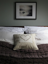
There are lots of colours that I like but quite a narrow band of colour that I love. My favourite colour is 'Is it grey? Is it blue? Is it green?' That's the best name for it!
There are some hues, which are called cusp colours. Apparently, our brains store colours under definite groupings. These shades are on the cusp of two (or three...) different groups. You can't, therefore, store them as an exact memory and have to keep looking at them to know what colour they are precisely. That's the theory but I find it true in practice too. That's exactly why I like them so much. Each time I catch a glimpse of the colour, I feel as though I am capturing it again for the first time. Lovely.
Here are my sample books:

I adore colours that need gazing into to see them fully. I find not all paint ranges do this. They just don't have the right intensity of pigment. That's nothing to do with brightness of colour but of the quality of the paint. I am a Farrow and Ball girl through and through, with the occasional foray into Earthborn, Paint and Paper Library or Fired Earth.
When I look at the paint charts or the samplebooks (which have substantially larger blocks of each colour), I find some colours seem to jump out at me. These are usually the colours that I then order sample pots for, which I paint on large pieces of A3 stiff paper.

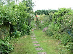
This is the best way to see if you truly like a colour. Good quality colours seem to change beyond belief from room to room and, even, from wall to wall. An excellent way to understand how the colour will build up intensity in a room is to hold the paper up to a corner and bend it so that half is on one wall and the other half on the adjacent wall. That way, it gets a chance to reflect back on itself, as it would if it were all over the walls, like so:

When this has narrowed down my choice, I then give the final test. I paint a large section of one of the walls to be decorated. And then....... I deliberate and contemplate and hesitate and consider and ponder and cogitate and ruminate and study and mull over and over and over....and then, hopefully, decide!!


2 comments :
When we first moved to this house, I spent about a year choosing a colour for the living room. I had about 56 different squares of sample pot colours on the wall. Jim found it exasperating and and we had a huge "Will you just bloody choose one" row. Finally I chose "celery green". So I may have the same mental illness as you. Though my indecisiveness spreads to other areas as you know...!!!
Love that cusp colour theory. And the painting onto A3 paper is very very clever. I will use that in the future.
End of long comment. I'm off to Oxford to see my brother (from Brighton) gigging with as swing band!!
Nothing wrong with 56 squares of colour in my book! Not indecisive but thorough!!
Post a Comment